Making Sense of Mass Data
Corporations produce extreme quantities of data. Understanding those data and generating necessary conclusions requires not only formulating the right questions or queries but also visually representing data in a way that we can “make sense” from.
Board Members' Darling
Complex issues in a nutshell.
Understanding data driven developments over time, see your project portfolio from past to present and projections, identify critical bifurcation points for key drivers of the future, spot market expansion opportunities based on visualization of matching algorithms are only examples for the manifold data visualization options available.
Parmenides EIDOS offers a multitude of visualization options that focus the results of questions or queries on the essential.
Controllers' spouse
Data at your fingertips.
Comparing plan, forecast or budget at all different levels of aggregation in one single visual. Zoom into details and back to the big picture. See the contribution of sales (shares) to the overall sales volume by continent, region, country and product at the same time. Transform data from your ERP system into valuable visuals.
Parmenides EIDOS interactive visual analysis tools support the day to day work of controllers by giving orientation in the data jungle.

Visual Scoremap
A Visual Scoremap supports the user in making goals operational and measuring their achievement. Establish a straightforward and differentiated value base for monitoring performance in multiple perspectives.

Next Neighbor Mapping
The Next Neighbor Mapping supports a multi-attribute and multi-dimensional search for matching/similar items and visualizes the results in a 3D representation.

Data Landscape
The Data Landscape visualizes the development of topic-related data over time. Identify critical moments in the development such as bifurcation points that could have repercussions on the overall development.

Data Trends
Dynamic timeline representation of time series, portfolios and other data driven developments in two or three-dimensional perspective.
Data Trends - Example
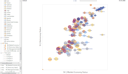
With kind permission of Bertelsmann Foundation to use and reproduce the data like this.
Dynamic visualization of the
Bertelsmann Transformation Index
(BTI) 2006-2016
This example demonstrates the results of a quick import of data to EIDOS by using Excel data of Bertelsmann Foundation. One can review the development of 129 countries concerning their democracy status and economic development over time.
Please note: this is an animated picture only. The use of EIDOS allows e.g. to display smooth transitions and to highlight specific countries of interest.
Learn more about the BTI here.
Data are available for download here.
Do you want to get a live feeling?
Arrange a demonstration to see how the EIDOS Visual Scoremap convinces you with a single picture.

